Inclusive Design

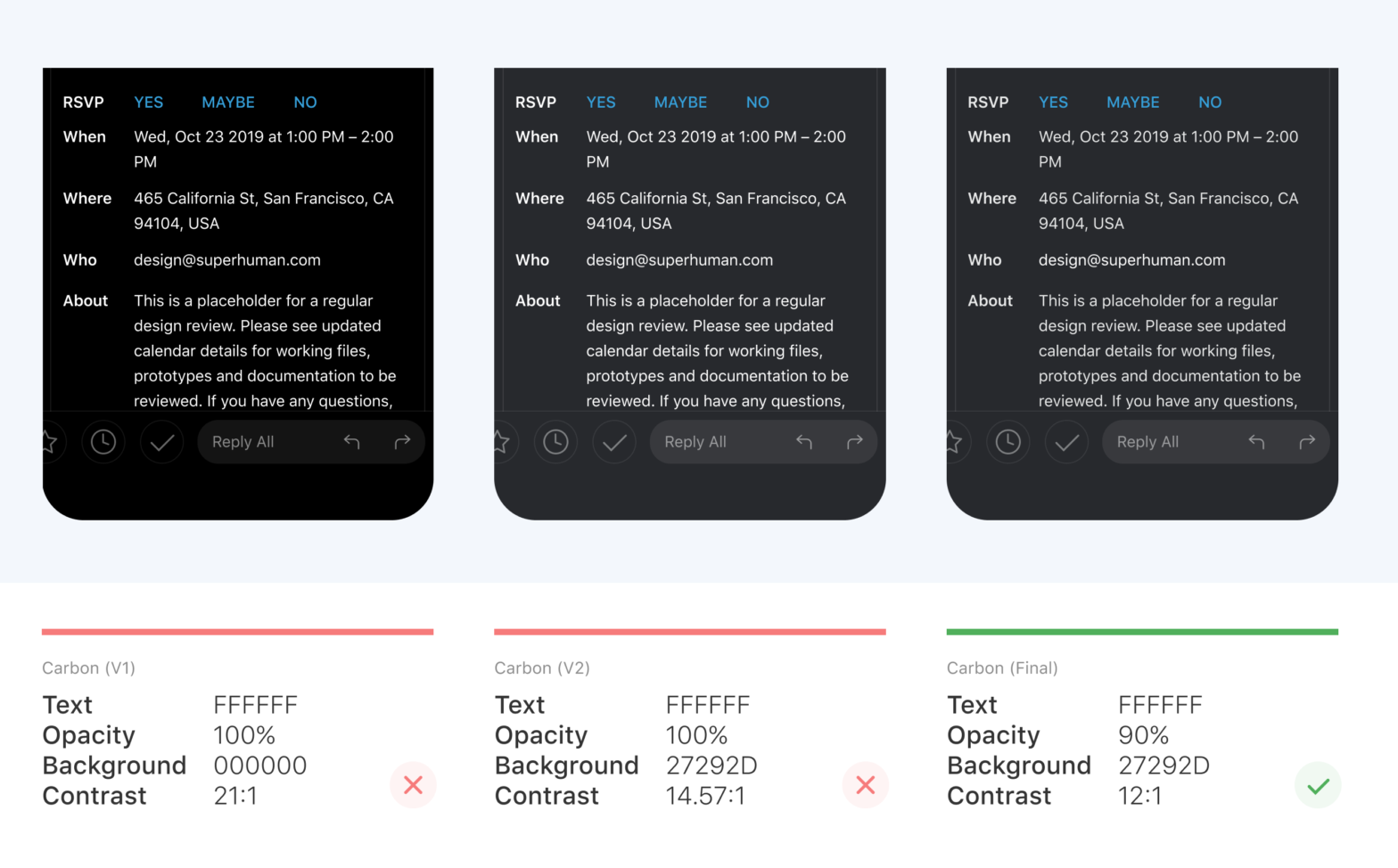
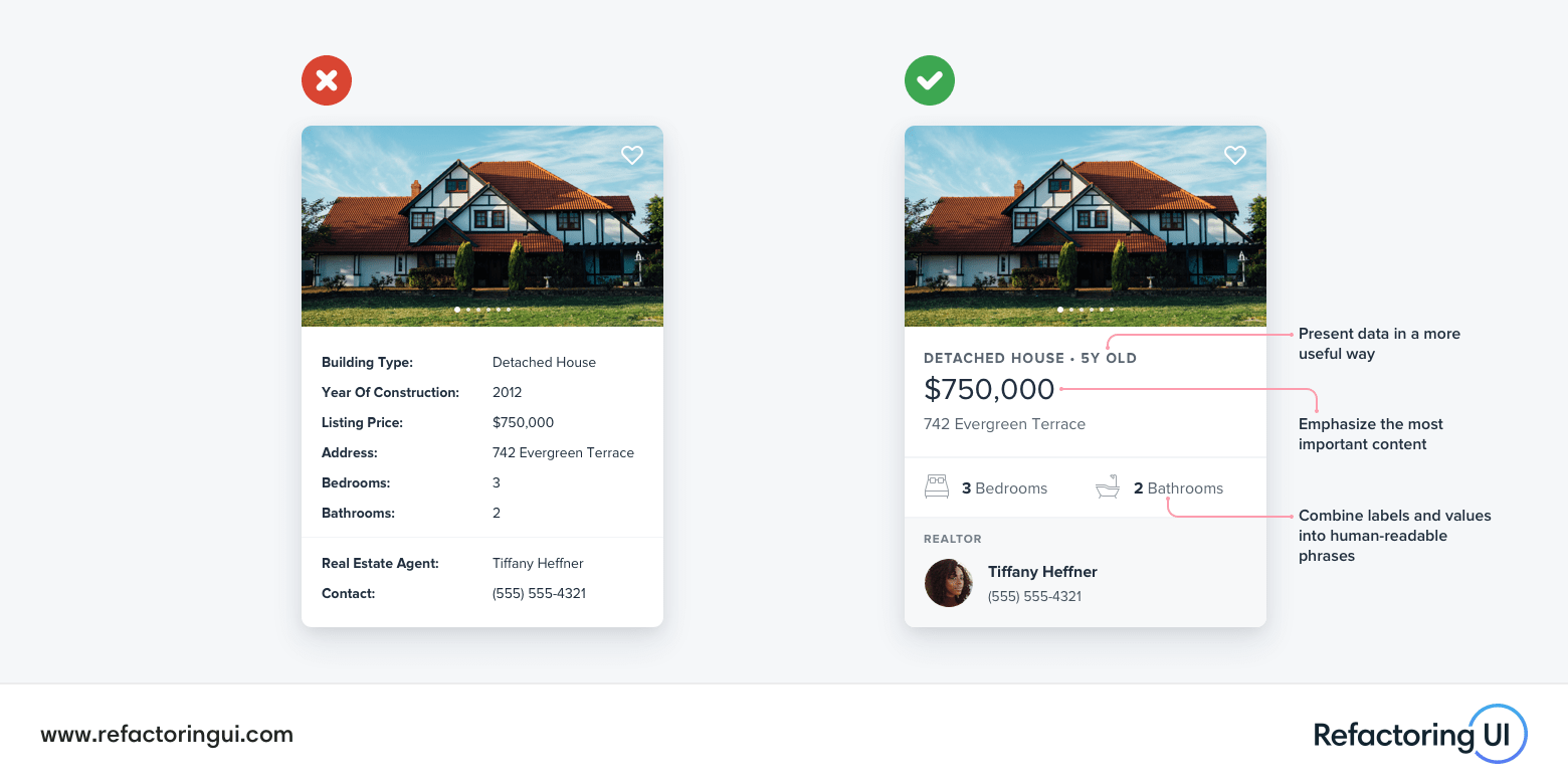
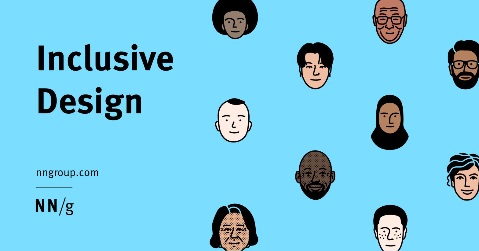
Inclusive design describes methodologies to create products that understand and enable people of all backgrounds and abilities. It may address accessibility, age, economic situation, geographic location, language, race, and more. Covered examples include: Text Legibility and Dark Mode for Older Users Surname Inputs for Global Audiences A Variety of Demographic Identifiers Inclusive Facets Diverse Illustrations …

Non-Euclidean Worlds Engine

Here’s a demo of a rendering engine I’ve been working on that allows for non-euclidean worlds. What kind of sorcery is this?! 🤯 I do wonder what would happen when multiple players are walking around simultaneously, and how objects that pass through the tunnels would behave. NonEuclidean (GitHub) → Related: How were the portals in …

Building Future UIs

The folks over at Formidable have been experimenting with Houdini and WebGL/Three.js to create futuristic UIs Futuristic sci-fi UIs in movies often support a story where humans, computers, and interfaces are far more advanced than today, often mixed with things like super powers, warp drives, and holograms. What is it about these UIs that feel …

CSS leading-trim – The Future of Digital Typesetting

Ethan Wang, who works at Microsoft: In a standard text box, there’s almost always extra space above and below the actual text. Because of this, when you use a text box to measure and implement spacing, it ends up larger than you intended. The bigger the line height, the bigger the problem. You can see …

Five UI Design tips for enterprise software

Johan from Mono: We have been designing a lot of enterprise software, which comes with its own set of challenges. In this blog post we captured some of the lessons we learned while creating the types of interfaces that are meant for daily, high-productivity use. Adjust your scaling Be wary of the application and module …

“But Apple does it that way”

Adrian Roselli: It is not uncommon that I raise an accessibility or usability issue with a client’s design or implementation and am met with either “But Google does this”, or “But Apple does this.” Mostly it is the default response to any issue I raise, but it is far worse when it is a reaction …

Fundamentals of Hierarchy in Interface Design

Visual hierarchy is the order in which the user process information by importance. In interface design, like in any other form of design, this concept is necessary to be functional at sight. With the correct use of hierarchy, the mind can group and prioritize elements to give them a specific order, which facilitates the understanding …

How to Design Delightful Dark Mode Themes

When done well, dark themes have many benefits. They reduce eyestrain. They are easier to read in low light. And, depending on the screen, they can greatly reduce battery consumption. However, it is difficult to create a delightful dark theme. We cannot simply reuse our colors or invert our shades. If we do, we will …

Chart Design Guidelines at City Intelligence

At the City Intelligence unit at City Hall almost anyone can create a data visualisation. To keep everyone in line they created Data Design Guidelines: Effective communication of evidence and data through information design and data visualisation, is obviously important to help inform policy internally, but it is also just as important to help boroughs …

Steve Schoger | Refactoring UI — Tips and tricks to make a site visually more interesting

As seen at the most recent CSS Day. I’m quite sure this will help many developers to make their POCs/experiments visually more interesting: Sometimes when we look at a polished interface we can acknowledge that it looks good but it’s hard to articulate why it looks good. In this practical session, Steve will be explaining …