GitHub Skyline — Your GitHub Story in 3D

Nice in-browser 3D-render of your GitHub History. You can download the result as a .stl file to run it through your 3D printer. Here’s my 2020 timeline for example: I take pride in the fact that my Saturdays (front row) and Sundays (back row) remain as good as empty, and that there’s an occasional gap …
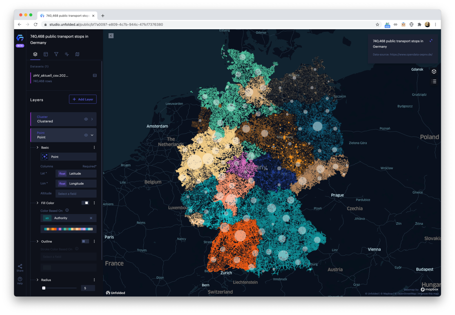
Unfolded Studio — Geospatial Data Reinvented

A geospatial analytics platform for data unification, enrichment, and visualization. It’s built on top of the aforementioned deck.gl and Kepler.gl Unfolded Studio →Unfolded Studio Example: All Public Transport stops in Germany → Sidenote: By the looks of it, the open-source Kepler.gl is doing the heavy lifting there.

Endangered Species visualized in Pixels

Imgur user JJSmooth44 scraped The Animal Planet endangered animals list and generated photos of several animals where each “pixel” represents one actual animal running around. The more pixelated the image, the closer it is to extinction. There are about 2500 Bengal Tigers, so the picture above consists of 2500 “pixels”: The Amur Leopard is less …

Mercator – It’s a flat, flat world!

In the 16th century, Gerardus Mercator, a Flemish cartographer devised a new way of depicting the world on a flat plane. We set off to explore his map in order to illustrate his biggest blunders, unearth curious facts and explain the advantages that make this representation of the globe still relevant today. I especially like …

Chart Design Guidelines at City Intelligence

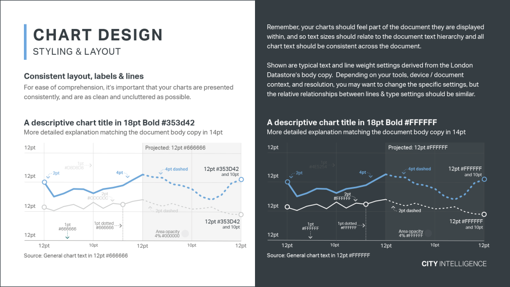
At the City Intelligence unit at City Hall almost anyone can create a data visualisation. To keep everyone in line they created Data Design Guidelines: Effective communication of evidence and data through information design and data visualisation, is obviously important to help inform policy internally, but it is also just as important to help boroughs …

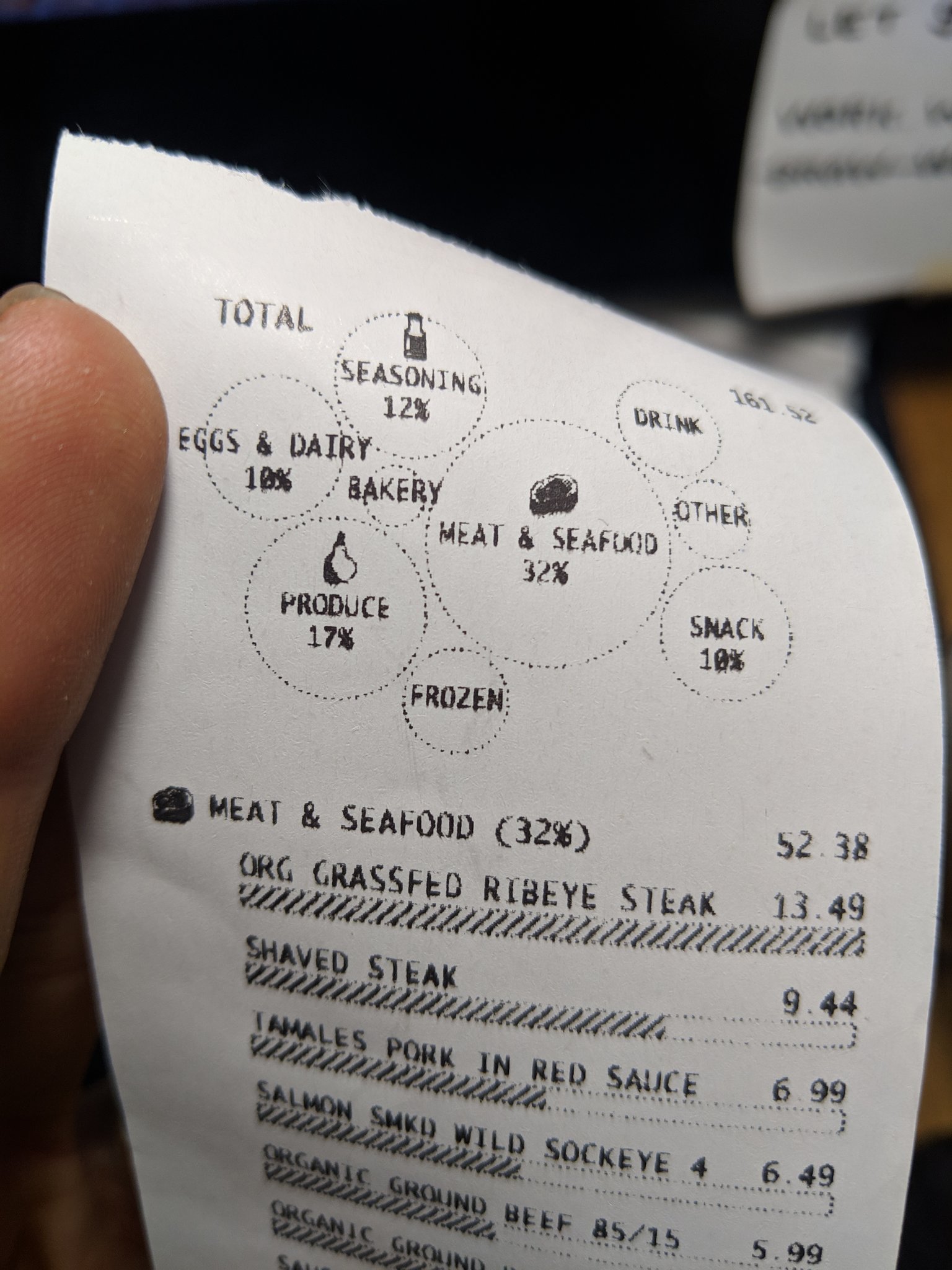
The Grocery Store Receipt, Reimagined

Data Visualization Engineer Susie Lu wondered: how can viz be integrated into everyday experiences?. This is what they did with the classical grocery store receipt: Wow, that’s … great! 😔 Unfortunately we all know that stores won’t do this, as it will lead to people to be more aware of what they are spending, and …

AR Experiments: Flight Paths – A visualization of flight data that floats around you.

Flight Paths is an experiment that transforms your room into a flight path visualization. Touch any horizontal surface and explore as flights take off from JFK or SFO and fly around your space. AR Experiments: Flight Paths →

SEDAC Population Estimator

The Population Estimation Service is a Web-based service for estimating population totals and related statistics within a user-defined region. It enables users of a wide variety of map clients and tools to quickly obtain estimates of the number of people residing in specific areas without having to download and analyze large amounts of spatial data. …