Automatic Text Balancing on the Web for Better Readability

Good proposal by Adobe as this is an actual problem we’re facing in web development right now. Results in better readability and as an extra it also prevents typographic widows

textbalance

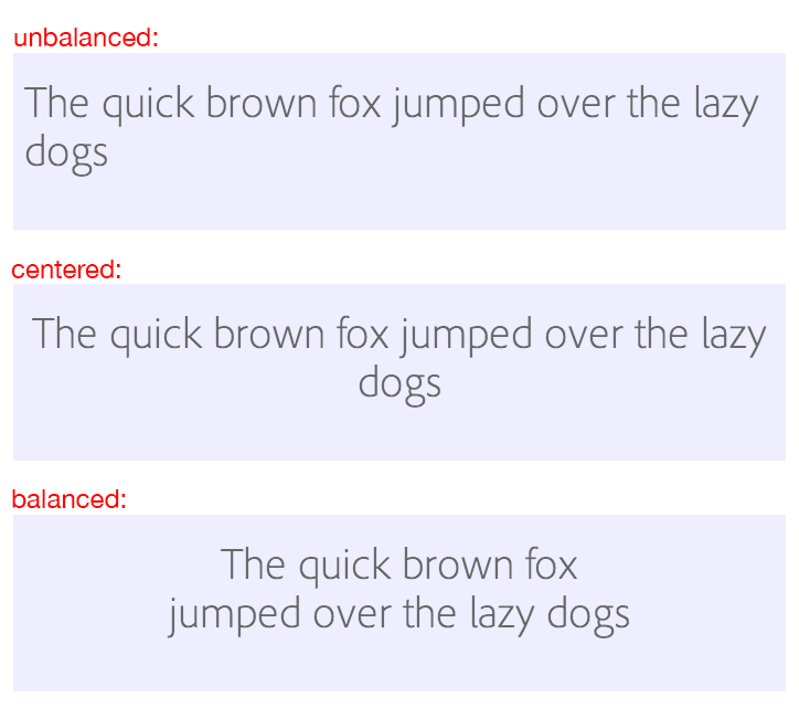
The proposed CSS looks like this:

h1 {
  text-wrap: balance;
}

Balancing Text for better readability →

The original article seems to be gone. Link was updated to point to a copy on The Web Archive.

Published by Bramus!

Bramus is a frontend web developer from Belgium, working as a Chrome Developer Relations Engineer at Google. From the moment he discovered view-source at the age of 14 (way back in 1997), he fell in love with the web and has been tinkering with it ever since (more …)

Leave a comment

Your email address will not be published. Required fields are marked *

This site uses Akismet to reduce spam. Learn how your comment data is processed.